Render Pipeline (WIP)
Render pipeline determines how are HTML and CSS is rendered to the browser, and grasping the render pipeline helps us understand how web frameworks/library works under the hood, and eventually helps us to build a much more performant web application.
Code references will be based on Chromium resources, the Blink render engine to be exact, other browser engines might differ in implementation but the fundamental concept should be mostly same.
Deep Dive
An Overall View
Have a look a the below picture to have a quick grasp on the overall process.
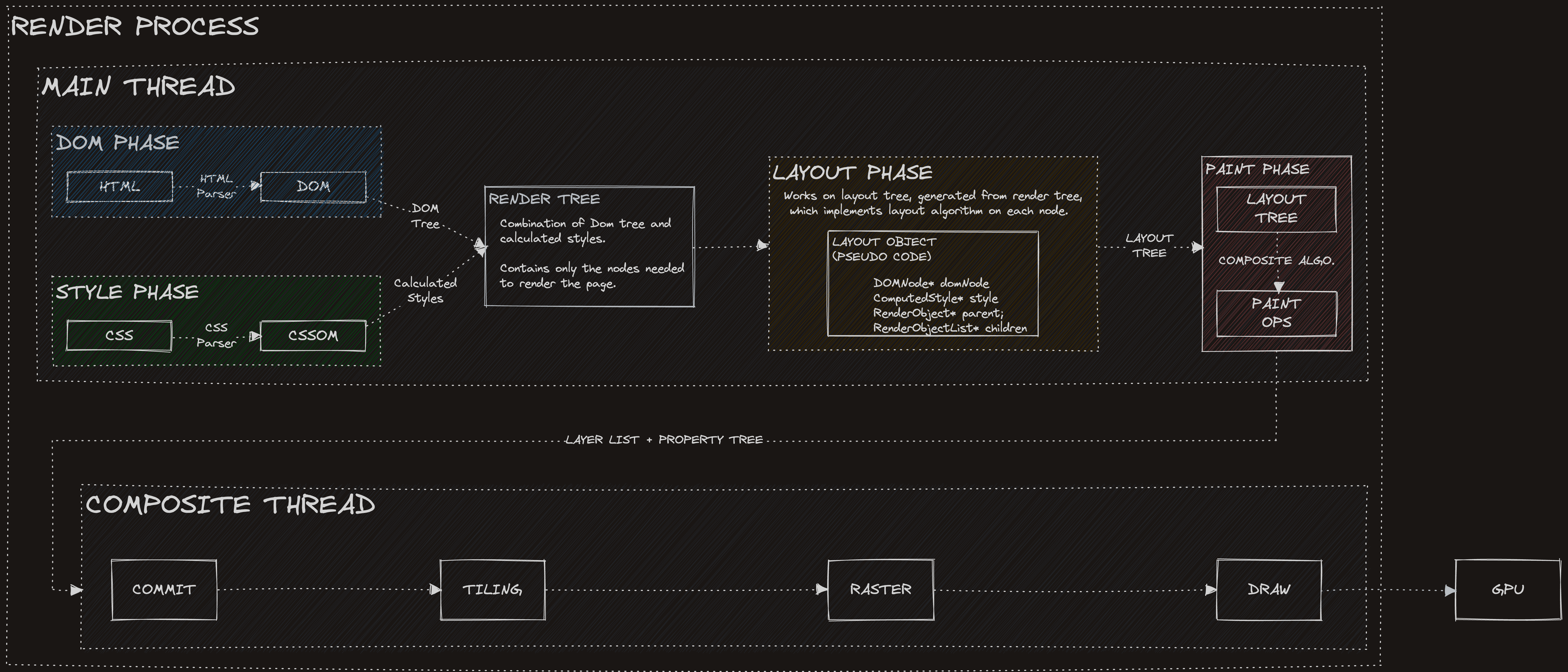
DOM Phase
Browser requests a HTML document to display, and receives a serialized HTML in response from the servers.
Here in this step, HTML parser included in the browser render engine, Blink of Chromium for example, is utilized to deserialize, parse and construct the DOM tree according to the HTML content.
The DOM tree is wrapped up with DOM API and exposed through the V8 engine with a system called bindings.
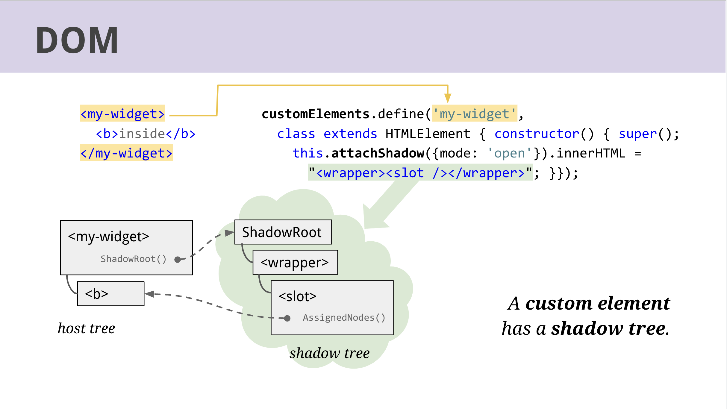
Advanced: How are custom elements handled?
A shadow tree class is used.
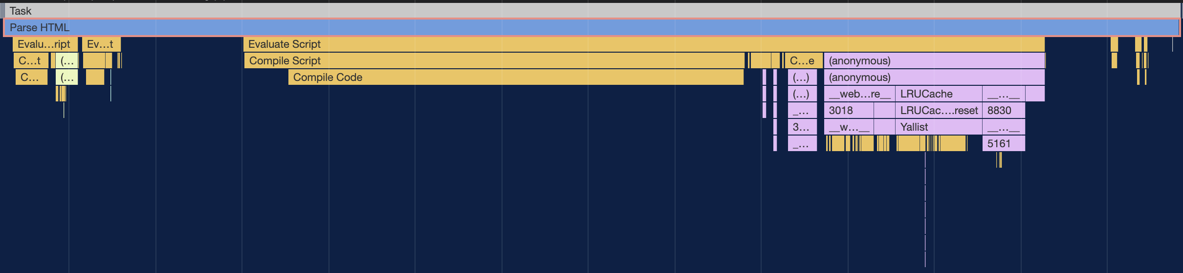
This step takes up a task named parse HTML in rendering.
Read here for more details on DOM-related implementation.
Further Readings
Style Phase
While the structure and components of a document is defined with HTML, it might also reference to CSS stylesheets defined with <link rel='stylesheet'/> tag to define how the components should look like.
Despite that CSS contents are often written in CSS stylesheets due to Single Responsibility Principle, it can also be defined through style tag or provided by browser.
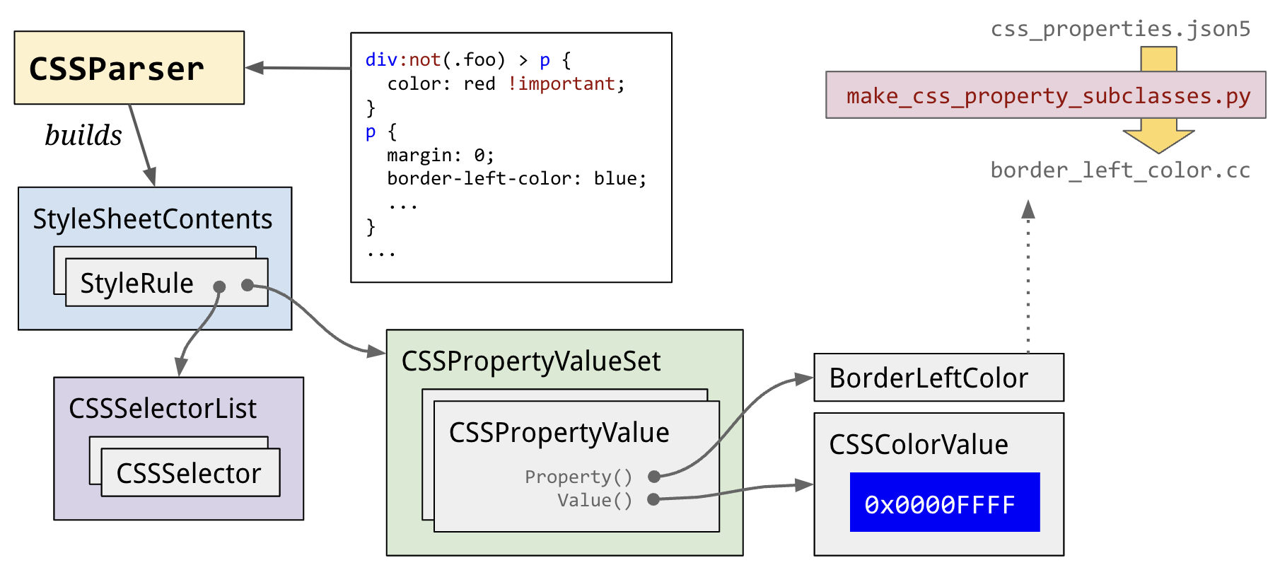
Much alike to the HTML DOM, CSS engine included in browsers will parse these stylesheets into CSS Object Model (CSSOM), which is a memory-efficient, lookup-efficient data structure that allows manipulating CSS from Javascript.
Below image by Steve Kobes pictures the detail implementation in Blink.
This step takes up a task named parse Stylesheet in rendering.

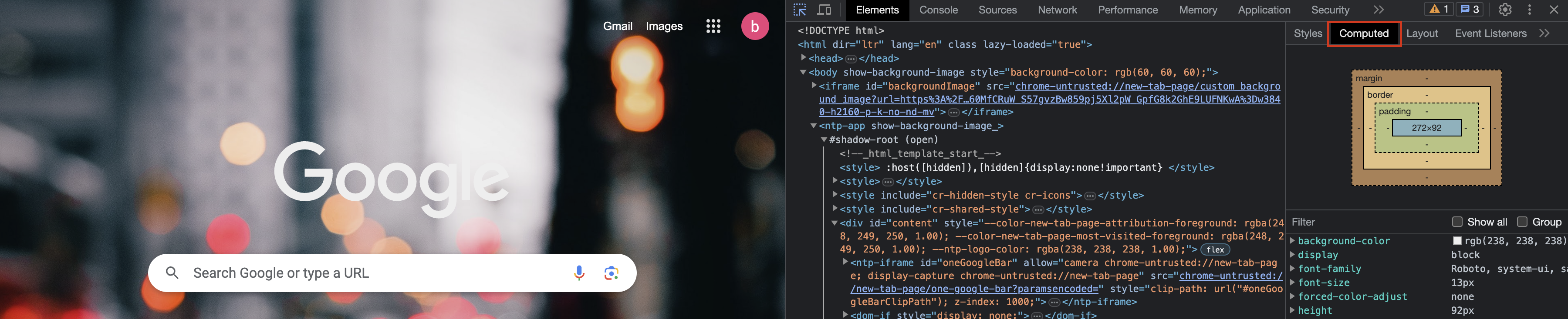
After active style sheets have been parsed, a step called style resolving (a.k.a recalc) takes all the parsed style rules from the active style sheets, and computes the final value of every style property for every DOM element.
These are stored in an object called ComputedStyle which is just a giant map of style properties to values.
❓ What if no stylesheets are provided ?
Read here for more details on style-related implementation.
DOM + Style = Render Tree
With previously generated DOM tree and CSSOM tree, they are combined to form a render tree, which includes only nodes that should be rendered.
Steps to construct a render tree can be roughly break down as follows:
Starting at the root of the DOM tree, traverse each visible node.
Omit nodes that are not visible (e.g script tags, meta tags, ...) during traversal, as well as nodes hidden via CSS property (e.g "display: none").
For each visible node, find the appropriate matching CSSOM rules and apply them.
Emit visible nodes with content and their computed styles.
Layout Phase (Reflow)
We have now know what to render with the render tree in place, but their exact position and size must be calculated since device viewports varies in width and height.
That's exactly what the layout stage does, which is also known as reflow.
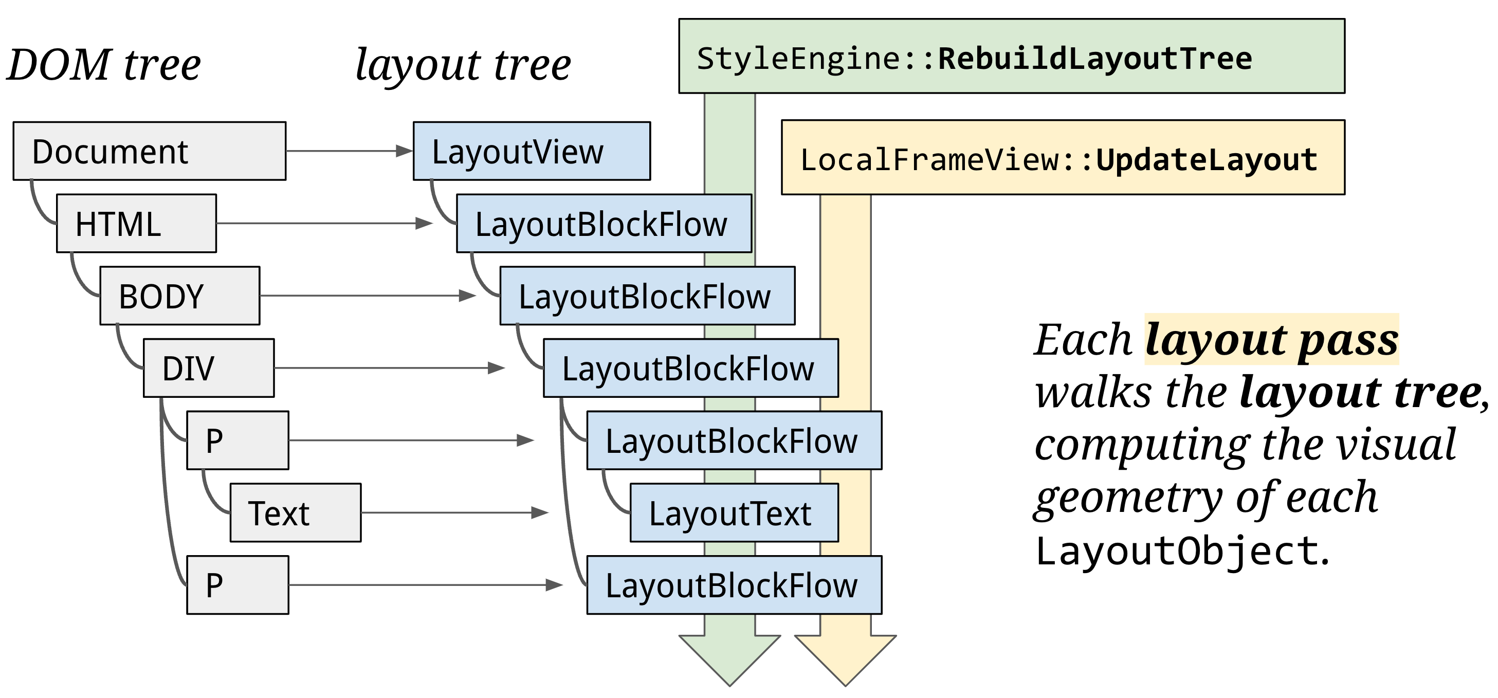
To calculate the layout of rendered objects, the main thread traverses the render tree from the root, culculating information such as coordinates and bounding box sizes, forming a layout tree. Layout phase operates on the layout tree, with each node represented with a LayoutObject that links to DOM element and implements the layout algorithms.
Usually, one DOM node gets one LayoutObject. But sometimes a LayoutObject has no node, or a node has no LayoutObject. It's even possible for a node to have more than one LayoutObject (for example, an inline element with text before and after a block child).
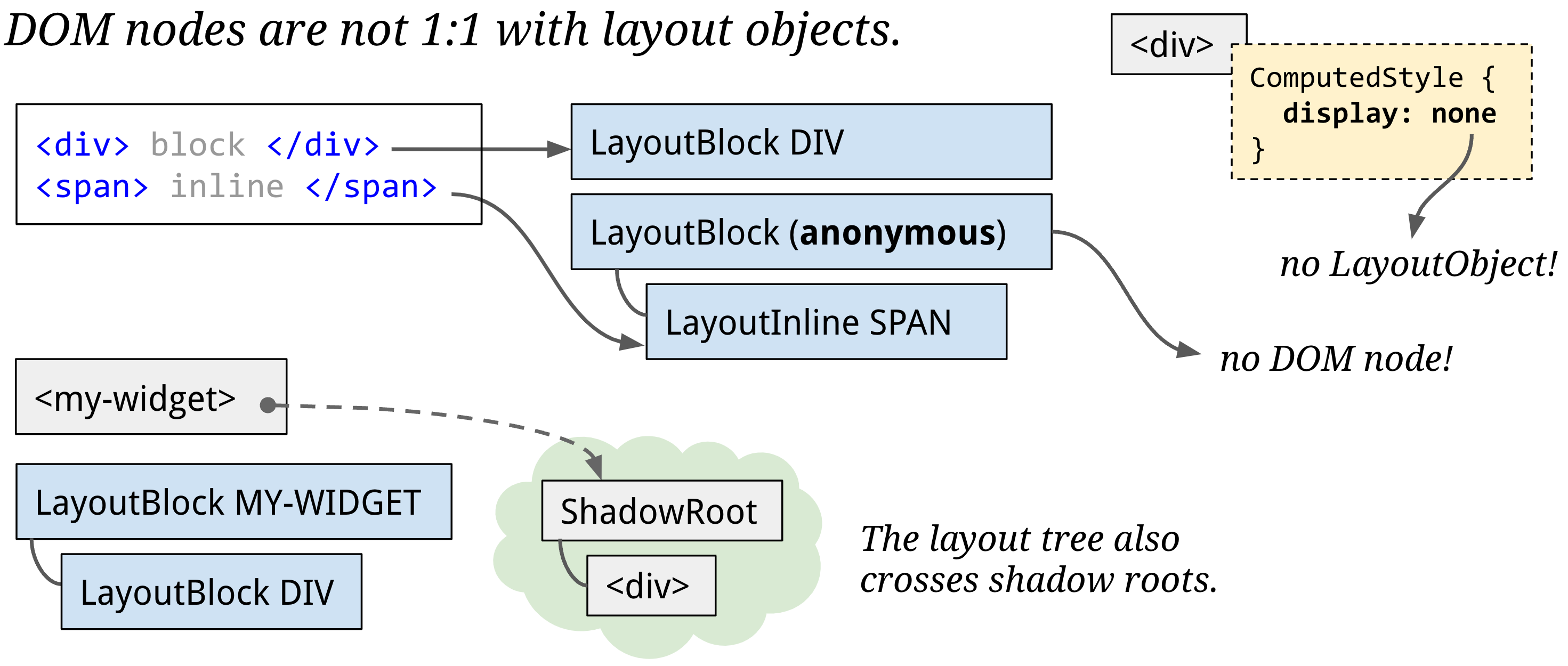
An important point is that layout tree might resemble the structure of a DOM tree, but it only contains elements that are visible on the page. If display: none is applied, that element is not part of the layout tree (however, an element with visibility: hidden is in the layout tree). Similarly, if a pseudo class with content like p::before{content:"Hi!"} is applied, it is included in the layout tree even though that is not in the DOM.
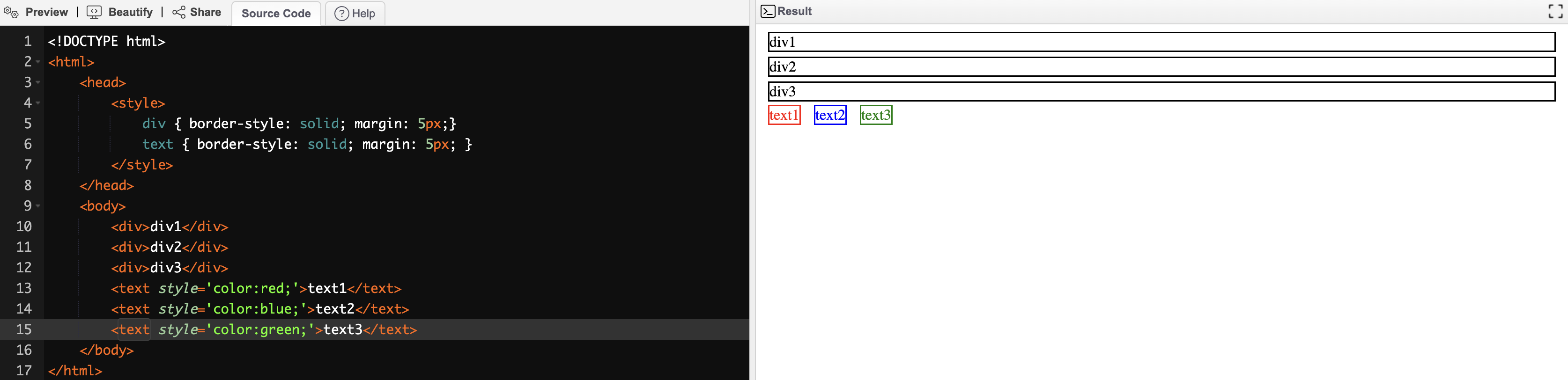
Another characteristic worth noting is that the calculated styles are cumulatively applied on the nested dom objects. Consider below html and the rendered result,
<!DOCTYPE html>
<html>
  <head>
    <title>Sample Inline CSS</title>
  </head>
  <body>
    <div style="color: red; padding: 10px; width: 50%; border-style: solid;">
      <div style="width:50%; border-style: solid">
        <p style="font-weight: bold; color: blue; border-style: dotted">This is a paragraph.</p>
      </div>
    </div>
  </body>
</html>

Notice that width of the outer div is half of the viewport, and inner div width is half of its parent, making it one fourth of the entier viewport width. Moreover, inner div inherits its color from the outer div, whie being overwritten on the p children. CSS rules inheritence is beyond scope of this note, but make sure to check it out to have a more comprehensive understanding of this phase.
The output of this phase is a box model, where the geometric region that each element occupies are calculated and represented with a rectangle called block.
In the simplest case, layout places blocks one after another in DOM order, descending vertically, while some elements such as <text> flow in an inline manner. This behavior of how blocks are arranged are called block flow.
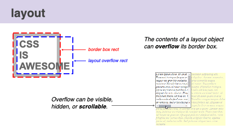
Multiple kinds of bounding rectangles for a single element can be calculated as well. For example, When there is overflow, layout computes both the border box rect and the layout overflow rect. If a node's overflow is scrollable, layout also computes scroll boundaries and reserves space for scrollbars. The most common scrollable DOM node is the document itself.
This video visualizes the process of the layout phase.
Determining the layout is a challenging task. Even the simplest page layout that merely contains blocks containing texts flowing from top to bottom, paragraph size, shape and line breaks are affected by css styles such as font-size, float, overflow, etc. And these computations must be done on the fly while each block affect each other simultaneously.
Given that layout process is expensive, caching mechanisms are adopted to avoid unnecessary layout computes. Moreover, grasping some knowledge of what styling operations might cause a reflow and what techniques can be utilized to avoid them is highly recommended.
Check furter reading for more materials to get a deeper insight.
📓 Further Reading
Paint Phase
With a DOM tree, computed styles and layout tree, we are still not ready to render our page to the screen! We now know the size, shape, and location of elements, but we still have to deterimne in what order should the browser paint them.
To determine the paint steps, the main thread walks the layout tree to create layer list and property tree through a compositing algorithm for the composite thread to paint our contents.
Composite Phase
Rasterization
📓 Further Reading
References
- An Introduction to Render Pipeline
- Github -- faressoft/dom_performance_reflow_repaint.md
- reflow和repaint引发的性能问题
- Constructing the Object Model
- Render-tree Construction, Layout, and Paint
- How Blink Works?
- Rendering Performance
- Render-tree Construction, Layout, and Paint
- RenderingNG Series
- The Chromium Project - Rendering
- Chromium Docs - Life of a Frame
- Understanding the critical path - web.dev